TechInformed 2.0 - Redesigning a tech newsroom for decision-makers
A complete UX + UI redesign of a global B2B tech publication, rebuilt from the ground up to improve readability, discovery, and revenue – across editorial, multimedia, sponsored content, and marketing solutions.
Project Brief
TechInformed serves CIOs, CMOs, analysts and technology leaders who make multi-million-dollar decisions every day – and they were doing it on a platform that worked against them. I led the end-to-end redesign of TechInformed 2.0, owning UX, UI, IA, Design systems, and the new mobile-first design framework. The result is a high-clarity, high-velocity editorial experience built for fast scanning, deep research, and long-form engagement.
Process
User Research → IA → User Flows → Wire frames → Scalable Design System → UI → Final Hand Off
Project Context
TechInformed was a fast-growing tech editorial platform publishing thousands of articles – but the website couldn’t keep up with the content or the audience.
The experience felt fragmented, hard to navigate, and visually outdated.
My Role
UX • UI • Design System | Platforms: Web + Mobile | Focus: Editorial, Search, Content Discovery, Sponsored, and Marketing Solutions
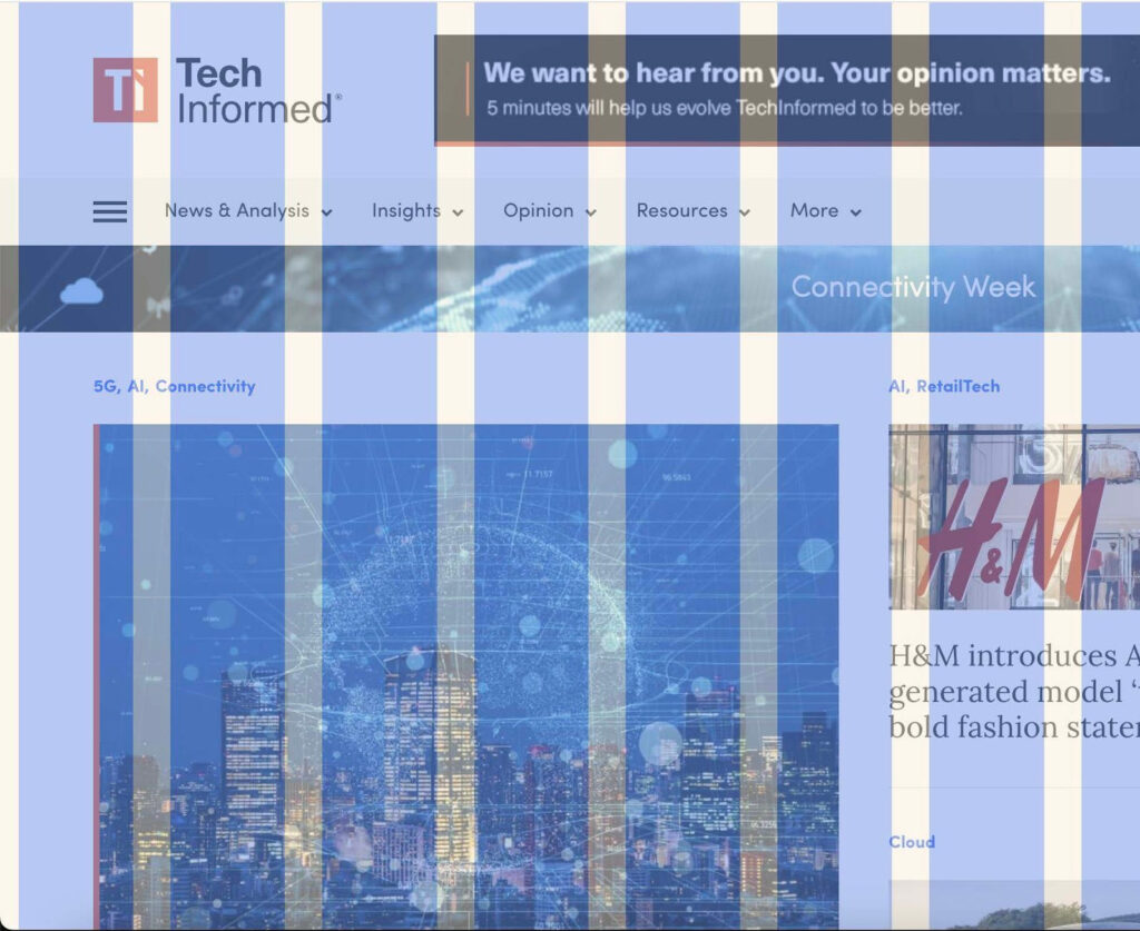
No mobile-first foundation — layouts collapsed on small screens
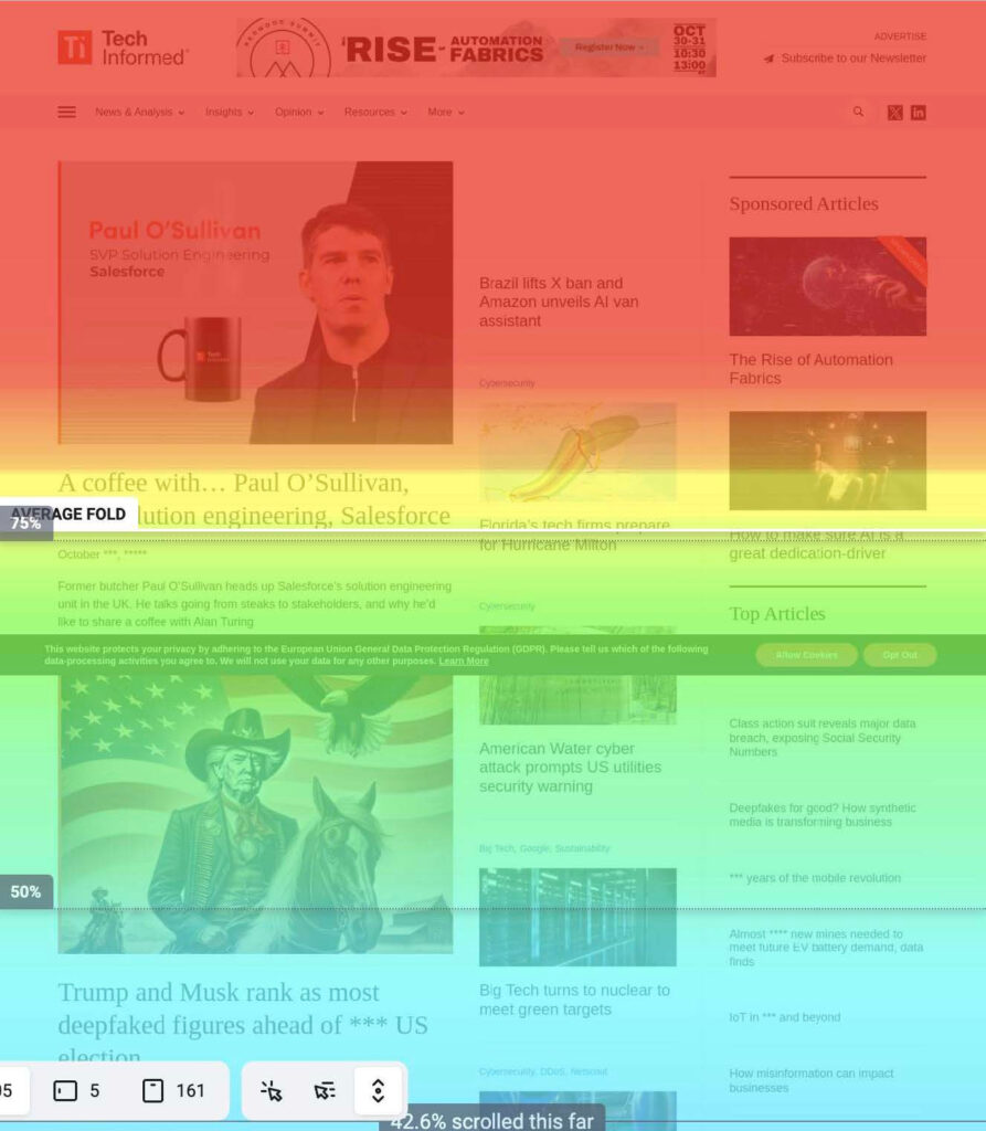
A full UX audit using Hotjar, scroll tracking, and layout inspection exposed why users struggled to engage with TechInformed’s content.
Heatmap: 75% users stayed above the fold.
REDESIGN STRATEGY & UX APPROACH
A Clear UX Direction
TechInformed needed a modern editorial system that was easier to read, easier to navigate, and easier to scale.
The Approach
Make content readable Stronger typography, bigger spacing, better contrast. Create real hierarchy Trending, featured, and multimedia needed different visual weights. Mobile-first modularity A clean, responsive system across thousands of articles. Continuous discovery Infinite scroll, smarter navigation, and personalized content. Respect editorial + revenue Ads redesigned to feel integrated, not disruptive.
INFORMATION ARCHITECTURE
A New Structure for How Readers Explore
The old IA was flat, unclear, and forced users to bounce between pages.
TechInformed 2.0 introduces a cleaner, topic-first structure built for fast scanning and deeper reading.
What Changed
Topic-first navigation: AI, Cybersecurity, Data, Connectivity and more — now clearly organized. Clean category architecture: Every section has its own page, identity, and layout rhythm. Modular page templates: Homepage, category, article, and multimedia built on one scalable system. Smarter cross-linking: Readers stay in-topic instead of jumping back to home.
USER PERSONAS
TechInformed serves three key reader types:
Approver (C-Suite / Decision Makers) Needs fast summaries, clarity, trust.
Evaluator (Managers / Analysts) Needs depth, comparisons, and reliable detail.
Recommender (Researchers / Contributors) Needs navigation guidance and topic-based discovery.
USER FLOWS
Each reader follows a different journey - the design needed to support all three.
Approver Flow: Skims fast → jumps into key topics → looks for quick insights.
Recommender Flow: Browses by categories → learns through guided pathways.
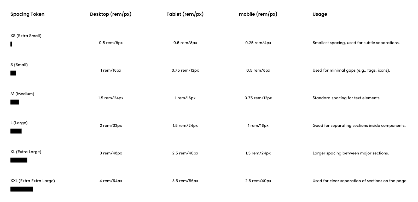
DESIGN SYSTEM
The TechInformed 2.0 Design System
A modular design system built to support thousands of articles, multiple content types, and a fast-moving editorial workflow.
What the system solves
Readability: stronger hierarchy, clean typography Consistency: one grid, one rhythm, one spacing logic Flexibility: scalable components for homepage, category & article Identity: bold use of Blood Orange and Tech Blue Accessibility: higher contrast, clear structure, better legibility
COMPONENT SYSTEM
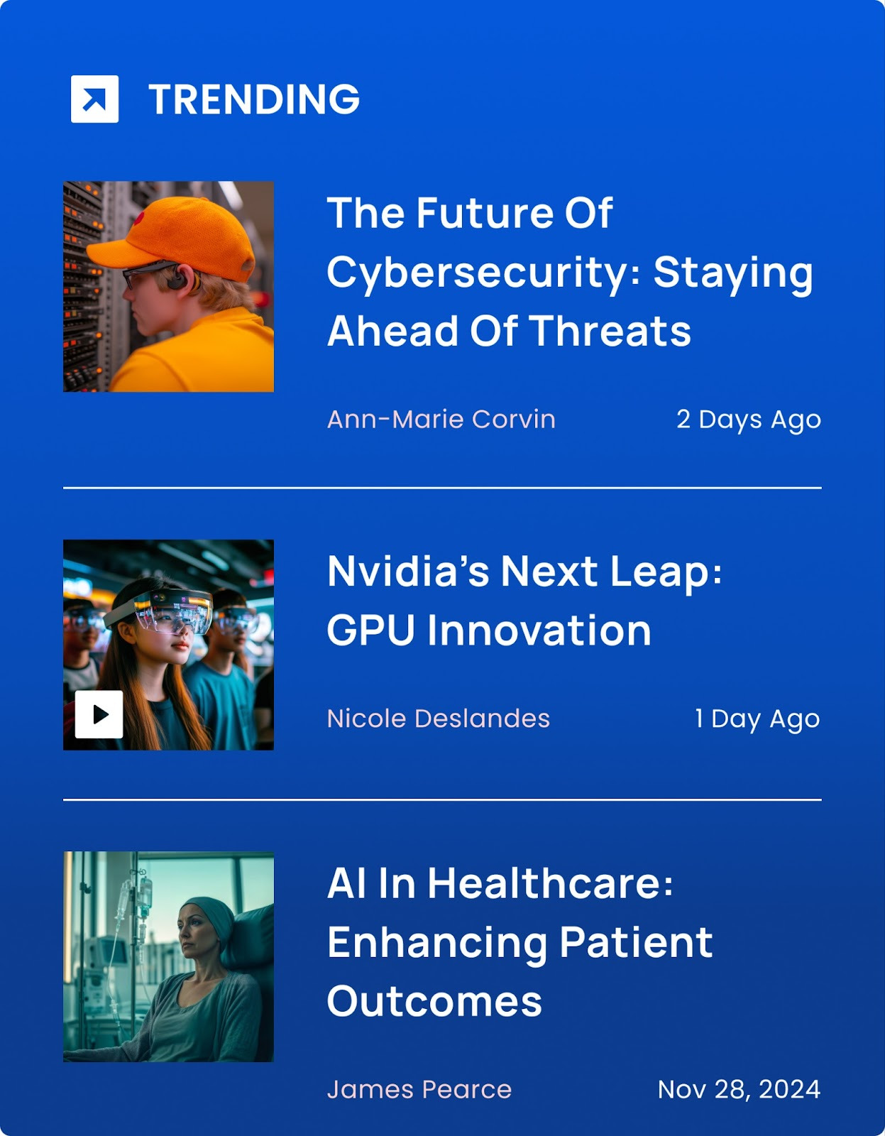
Trending Card — Built for Fast Scanning
Readers want to know what matters right now.
The trending card uses strong color, tight spacing, and a fixed image ratio to pull attention instantly – without overwhelming the page.
What it solves:
Gives editors a powerful spotlight Creates visual hierarchy Boosts click-through on priority stories
Personalized Feed — Content That Adapts to Each Reader
TechInformed covers huge topics.
The personalized feed uses topic bias, author patterns, and browsing behavior to surface relevant stories.
What it solves:
Higher session duration Better discoverability Feeds readers what they actually care about
A Coffee With… — A Unique Identity for Editorial Series
This special editorial format needed its own visual personality.
A subtle gradient, clean typographic spacing, and strong meta help it stand apart from regular news.
What it solves:
Clear content grouping Stronger editorial identity Consistent experience across episodes
Category Card — Clear Entry Points Into Major Topics
Simple, bold, and consistent.
Category cards help users jump directly into the topics they care about.